When it comes to branding, colour is more than just the colour of a truck making an express T-shirt printing delivery, it is the infamous ‘first impression’ which (consciously or unconsciously) explains what it’s all about. The ‘eyes’ to the brand’s soul, if you will.
Red is exciting and dangerous. Blue is trust-worthy and cold. Green is refreshing and boring. Colours are a language in itself, which is why when creating a brand, designers put great emphasis on finding just the right shade. As you will see next, changing the colour of a brand can alter its presence, completely.
Just last year, Carlsberg went through a serious rebrand. In order to compete with the ever-growing craft beer market, the company changed the colour of its bottle from green to brown and designed an entire marketing campaign around its Danish origins. The results? In six months, net revenue grew 2% and net profit went up by 23%.
With that being said, we introduce:
Our third edition. A creative exercise where we pick two competing brands and swap their colours.

When switching the colours of these two, you immediately see a difference. Airbnb’s Bélo (pronounced bay-loh) stops being warm and fuzzy and becomes colder while Booking.com is no longer professional and turns into something less serious. This shade of pink (dubbed Rausch by the designers) doesn’t go very well with the cold ‘.com’ in the end.

This change simply doesn’t work. When you make Amazon Prime’s logo unicolour, you lose the prominence of the parent company. Also, when you take away Netflix’s iconic red, the subtle screen-looking curve at the bottom gets lost.
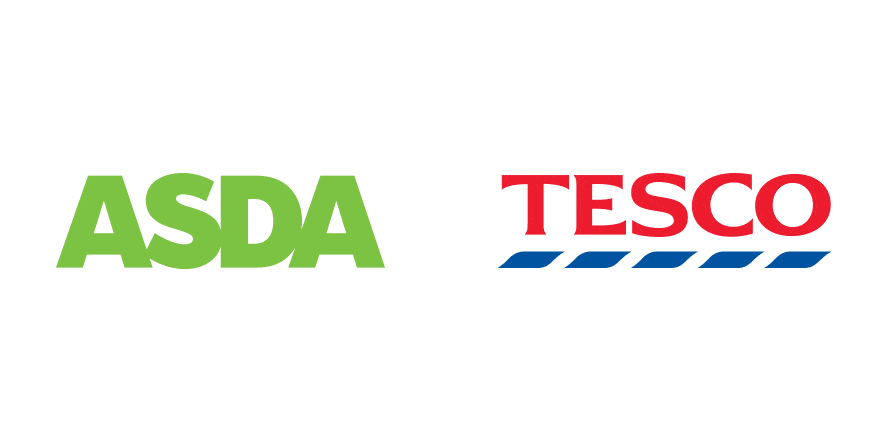
Asda is about freshness, while Tesco’s mission is all about helping people. Which makes sense when you think that green is always reminiscent of nature and the environment while blue and red are conservative — patriotic even. Once you swap the colours, those meanings are lost.
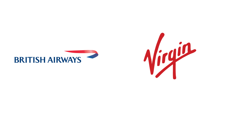
If you read our post on brand archetypes, then you’ll remember that British Airways fits the ‘Ruler’ type. By switching its colours with Virgin, they appear to lose their leadership. Things don’t get much better for Virgin, though, because when the signature red gets taken away, so goes the edge.
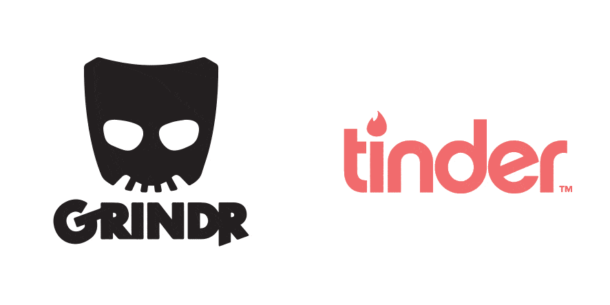
Personally, I think both colours could work for either brand. The pink on Grindr gives it an ‘ironic’ touch, while the black on Tinder makes it look like it’s for adults only. Frankly, not a look either would be hurt by. In the end, both apps offer the same service, what changes is their approach.
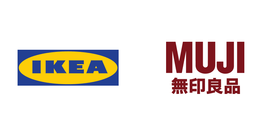
They both sell (mostly minimalistic) products for homes at affordable prices. Aside from the scale, the only thing that sets them apart is their countries of origin which both companies proudly showcase in their logos. IKEA comes from Sweden and Muji from Japan. If you swap the tones then this would be more difficult to know.

Thanks to its redesign, the Juventus’ logo works well with either two colours or unicolour. On the other hand, Atlético needs more than one to distinguish the different elements on the shield.

Of all of the colour swaps so far, this one is the least dramatic. Both logos are solid enough that they can work with either blue or red.

If you don’t know the origins of the Xbox brand colours, do yourself a favour and go read about it now. Switching these two is not as painful as we might have thought. After all, they’re the same product (video games, technology) and are geared toward the same target.
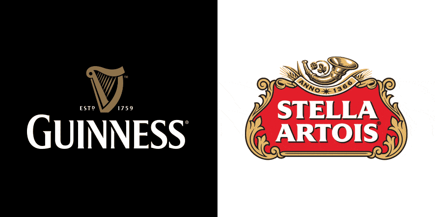
The moment the colours change, it’s almost like the tastes change as well. Guinness is a much darker, heavier beer while Stella is more light. While the swapped logos don’t look bad, they simply don’t work for the product they’re selling.
.png)
Happy Customers

Express Service

Star Rating

Quick & friendly custom clothing printers in the UK. From bulk t-shirt printing to corporate workwear, we deliver quality results every time.

